Tag Archives: Color

Review: Gradient Style

Review: Gradient Style post image

Gradient-01

First, the facts:

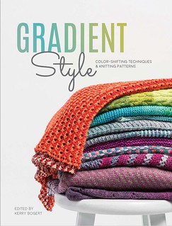
Title: Gradient Style: Color-Shifting Techniques and Knitting Patterns

Editor: Kerry Bogert

Published by: Interweave Knits, 2018

Pages: 160

Type: Knitting patterns

Chapters:

Introduction
Getting Started
The Projects

KS: Gradient Style

The In-Depth Look:

I’ve always loved gradient yarns–the way the color flows from one shade to the next appeals to me. These days, there are so many talented dyers putting out such lovely color combinations, but it’s not always easy to find the right patterns to go with them.

This book addresses that.

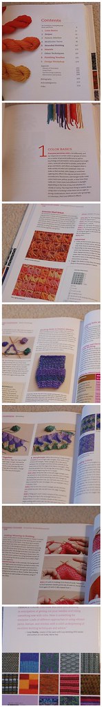
To start, the book talks about how to choose and use gradients, whether that’s through putting together your own combination or using one commercially available. There’s a nice description of how to use the Color Wheel with all its hues and tones, compliments and analogous colors. There are suggestions for combining and using your own choices–should they be semi-solids? Speckled yarns? A mix of both?–as well as a discussion on how to blend the colors in your knitting. All useful information.

This is followed by nineteen patterns of various things you can knit with your gradients. There is the usual blend here–some sweaters, some scarves, some cowls, socks, even a pair of mittens. All of them (obviously) use gradients, sometimes set against a solid color, sometimes in blocks, sometimes as a fair isle style stranded color pattern.

Really, I’m never going to complain about patterns using color gradients.

You can get a copy of this book at your local shop or buy it here at Amazon.

Want to see bigger pictures? Click here.

This review copy was kindly donated by Interweave Press. Thank you!

My Gush: Who doesn’t love gradients?

Bright & Cheery Tea Set


Project Brief: Design a cheery tea set for a Sunny client. 1x tea cup, 1x saucer, 1x napkin

The brief called for the design of a teacup, saucer, and napkin... but who could resist not designing the entire set?! Not I! I love tea!

What should it have on each piece? I'm not a big fan of the lacy, teensy, frilly flower on my tea sets as many traditional ones do.  And lately, I've been really enjoying working with traditional printmaking methods especially linocut. I made a bunch of patterns and arrangements using stamps I made on my own, and some I took into the digital realm and began testing repeats that way. I was really excited to use my recent patterns on something I'd love to own and see every day. I'm a big fan of tea and the paraphernalia that comes with drinking it.

So I set about sketching and came up with a concept that I'd love to have in my own home. The sketch gave me a general idea of how I'd present my work, and then I set about testing colors.
My first tests with pink...

Oh, I was so unhappy with this color combo! It's not me at all! I'd never buy it. After asking my fellow finches why I hated this so much, they reminded me I don't usually use pink in this way... and they're right, this is not really my shade of pink, nor do I own any pink tableware or pair it with sunshine yellow. Out went the pink!


Once the bright aqua and seafoam green went in, I was gelling. The work just came together so quickly. I knew I had to have sugar tongs and a sugar container, a little creamer, too! Finishing touches...


And lastly, I went to work balancing the tea-set. I wanted to have a nice mix and match tea set and napkins that could work in many different combinations. So the second saucer carried the more intense color, and the mugs match. The tea tray got a nice under-pattern and texture to match.

There you have it! Tea for two... a cuppa for me and one for you!

Summer & June Gloom

My Summer Finch for the Finch & Foxglove site!

Did you know about June Gloom in Southern California? I just learned about it at the end of last month. I actually really like it!

So what is it? It's this weather phenomenon where clouds form over the ocean along the coast and the winds move these clouds onto land creating a foggy, cool atmosphere. I LOVE the cool mornings!

All this talk of beach and clouds and such has me all in a tizzy making artwork about fish and water! Did you see my new summer finch up top? It's now live on the Finch & Foxglove homepage, too.

Thinking about the beach...


And the water...

And I've been sewing too, I just haven't had the chance to photograph the garments I've made for my son and me. I participated again in MeMadeMay but again didn't post photographs. I wore lots of me-made clothing for Surtex in fact! I must do a sewing recap post soon.

Process: Advent Calendar Noel Image

Hello! I just wanted to introduce myself in case you hadn't met me before.  I'm Adriana Hernandez-Bergstrom!  I go by Adriprints on my work, and  you can find me really easily with that moniker.  I'm the founder of the Finch & Foxglove art collective, and I did the first illustration on our digital Advent Calendar.

I am a really process-oriented person and I love learning how others get to the images they do.  I hope you can learn a little bit from my process too!

The "Noel Peppermint Bark" illustration started off as a doodle that I did in August or September.  I was at my mom's house playing around with an old watercolor set that I had left at her house in case all my luggage was lost.  In my mind, I was working on a tropical-Christmas kind of theme...


In between then and now, our group came up with a wonderful color palette for our advent calendar.  We looked at vintage Christmas postcards to get us started.  These colors were rich and wonderful, but not really tropical... and I really wanted to use the "Noel" lettering.  So I traced the lettering in Adobe Illustrator with the pen tool, used a color from our palette, and started working on composition with the other illustration assets that matched the palette a bit better.  I had created these assets or icons a few weeks ago by painting in watered down gouache.  They were extras from the greeting card project I did in October, and I did a direct "live trace" using Adobe Illustrator to capture them...


Once I had a composition that I liked, I brought each element separately into Photoshop, converted them to Vector Smart Objects and began to add texture and depth...


I really wanted a rich feeling like chocolate in the background, and at first I tried mint + chocolate with the lettering...


But, as you can see it looked a bit too cold in this version.  It read like mold or marble or something unappetizing.  So, next I tried peppermint, and that is what you see in the final image.  A little bit tastier, I think!


This is just one of the many illustrations in our wonderful digital advent calendar.  Follow along on our Finch & Foxglove Advent Calendar page!

Chicken Picnic


This is my final piece from the Make Art That Sells Course (Part B).  It was a revelation for me to just do what I do in response to a brief, and use my icons that were created on a whim earlier this year and then put it all together.  It's a revelation to just be in a flow and making work.

I asked my teammates from Finch & Foxglove for feedback and adjusted accordingly.  It's been really nice to be able to get into a groove and feel like you had a place to turn for a dialogue about your work.

As for process, at the end of the summer I painted these chickens in watercolor and gouache.  This past week I drew most of the rest in marker, brush-pen, watercolor pencil, and gouache.  The textures I've been collecting all year, and I made some more.  I shared some of my textures recently on a live Periscope broadcast too!


I thoroughly enjoyed MATS B as it seems the topics suited me better.  In addition, though, it looks like I've grown some confidence between MATS A in March and MATS B in October.  Cheers to vast improvements and self-confidence!

Also, I'd like to invite you all to follow along with our Finch & Foxglove Advent Calendar starting December 1st.  Watch the advent calendar page here!

Scrapbooking: Greetings from the Lido Deck!

I am so happy with this one!  I couldn't believe I got it done on time to be considered for the Make Art That Sells weekly review either.  Our things finally arrived from Germany and it meant we were in super-unpack-cardboard-box-processing mode!  But, I was also in a "making mode" as well as "where the heck is my scanner mode"... and so I made and found my scanner at last.

Here is my work resulting from the theme we were given: vintage cruise ship correspondence.  It's a bit of a mash-up but I think between the chosen color palette and my brush pen illustrations which have a late 50's early 60's vibe in them, that it's enough to cover the vintage aspect.   I really wanted a Piña colada after drawing this... love those so much.


A Group of Charming Cuties

Last week, I had something very interesting happen.  I had a kind of cute-splosion.  I started illustrating for the children's apparel market so I can begin to pitch my work.  I did some short research by looking at my son's clothes and picking out my super-top favorites.... and then it all just flowed.

It was remarkable.  I just worked on Illustrator and out came these characters and their back-stories and little lives.  I kept wanting (and still do) to keep on drawing them and their accessories and interactions...


Next, I want to develop each character on their own!  What do you think?

Review: Essential Guide to Color Knitting Techniques in Paperback!

Review: Essential Guide to Color Knitting Techniques in Paperback! post image

011410_color_0001

First, the facts:

Title: Essential Guide to Color Knitting Techniques

Author: Margaret Radcliffe

Published by: Storey Publishing, 2015

Pages: 319

Type: Fabulous reference.

Chapters:

1. Color Basics
2. Stripes
3. Pattern Stitches
4. Multicolor Yarns
5. Stranded Knitting
6. Intarsia
7. Other Techniques
8. Finishing Touches
9. Design Workshop

Color Knitting Techniques

Pattern Size Range: Not really applicable

The In-Depth Look:

This is a fantastic book–one I’ve gushed about before. But now you’re in luck–because this useful reference is now available in paperback!

So far as I can tell, it’s exactly the same as before and, flipping through it, I’m impressed all over again at the breadth of information here.

Don’t believe me when I tell you how great it is? Well, here’s my review from 2010:

Oh my, may I gush? It’s gauche and unrefined to gush, but … wow. If you like using color in your knitting, you really MUST check out this book.

Entrelac. Stranded. Intarsia. Stripes. Two-sided. There are so many ways to play with color while you knit, but simply because there are so many ways to add different colors to your knitting, it gets confusing. What’s a knitter to do?

Run, don’t walk, to find a copy of this book. It’s an amazing reference.

What? You’re skeptical? You’re thinking, “But Deb, you like almost everything.” And it’s true, it’s rare, rare, rare that I can’t find something to like in a knitting book–and even the not-wonderful ones took as much work as the wonderful ones. Not finding something to like just seems unnecessarily cruel. But, I’m telling you, this book is fantastic.

First, she touches on every method of using color that I’ve ever heard of. (Or, at least, I can’t think of any that she missed.) She discusses color theory and how to judge which colors will go with others. She provides stitch patterns using different color yarns. She discusses ways to use and highlight yarns that are already multi-colored. She provides patterns to highlight various techniques. She gives hints and tips on weaving in ends and avoiding the “jog” at the ends of rows of circular stripes, discusses how to do shaping while maintaining a color pattern. She discusses basic design theory…

This list could get very long. How long? Let me put it another way … to give you an idea how many things are covered in this book? The list of references is four full pages long. The index at the back is six pages long.

This is no lightweight book.

Add to all this excellent photos and descriptive, knowledgeable writing. This book is SO worth a spot in your library if you’re even remotely interested in knitting with colors.

This fantastic reference is available at Amazon.com.

Want to see bigger pictures? Click here.

My Gush: Run, don’t walk to find a copy!

Other posts for this author: