-
Recent Posts
Recent Comments
Tags
architecture art autumn boats Books christmas colors Cooking DIY everything else Family Farm Features flowers food garden gardening HAIRSTYLES holidays Kids knit Knitting Knitting & Spinning Lighthouses Martha's Vineyard Massachusetts Memories New England New Jersey New York New York City Oak Bluffs Pets photo a day photo a day challenge Photographs postaweek Seasons Sewing sky Spinning Uncategorized water Wordpress yarnArchives
- April 2026 (1)
- March 2026 (2)
- February 2026 (1)
- January 2026 (1)
- December 2025 (4)
- November 2025 (3)
- October 2025 (1)
- September 2025 (1)
- August 2025 (1)
- July 2025 (1)
- June 2025 (1)
- May 2025 (1)
- April 2025 (1)
- March 2025 (3)
- February 2025 (2)
- December 2024 (1)
- November 2024 (1)
- October 2024 (1)
- September 2024 (1)
- August 2024 (2)
- June 2024 (3)
- May 2024 (1)
- April 2024 (1)
- March 2024 (3)
- February 2024 (1)
- December 2023 (4)
- November 2023 (3)
- October 2023 (1)
- September 2023 (3)
- August 2023 (3)
- July 2023 (4)
- June 2023 (1)
- May 2023 (2)
- April 2023 (3)
- March 2023 (3)
- February 2023 (2)
- January 2023 (5)
- December 2022 (4)
- November 2022 (2)
- October 2022 (2)
- September 2022 (1)
- August 2022 (1)
- July 2022 (5)
- June 2022 (5)
- May 2022 (5)
- April 2022 (2)
- March 2022 (2)
- February 2022 (1)
- January 2022 (2)
- December 2021 (2)
- November 2021 (2)
- October 2021 (5)
- September 2021 (6)
- August 2021 (6)
- July 2021 (3)
- June 2021 (4)
- May 2021 (4)
- April 2021 (1)
- March 2021 (6)
- February 2021 (7)
- January 2021 (6)
- December 2020 (4)
- November 2020 (6)
- October 2020 (3)
- September 2020 (4)
- August 2020 (3)
- July 2020 (6)
- June 2020 (6)
- May 2020 (4)
- April 2020 (5)
- March 2020 (3)
- February 2020 (2)
- December 2019 (1)
- November 2019 (4)
- October 2019 (8)
- September 2019 (4)
- August 2019 (11)
- July 2019 (8)
- June 2019 (29)
- May 2019 (22)
- April 2019 (18)
- March 2019 (26)
- February 2019 (21)
- January 2019 (58)
- December 2018 (207)
- November 2018 (108)
- October 2018 (34)
- September 2018 (31)
- August 2018 (35)
- July 2018 (41)
- June 2018 (110)
- May 2018 (60)
- April 2018 (25)
- March 2018 (23)
- February 2018 (10)
- January 2018 (17)
- December 2017 (22)
- November 2017 (15)
- October 2017 (32)
- September 2017 (16)
- August 2017 (17)
- July 2017 (19)
- June 2017 (12)
- May 2017 (14)
- April 2017 (12)
- March 2017 (9)
- February 2017 (23)
- January 2017 (20)
- December 2016 (43)
- November 2016 (31)
- October 2016 (20)
- September 2016 (28)
- August 2016 (28)
- July 2016 (40)
- June 2016 (81)
- May 2016 (38)
- April 2016 (39)
- March 2016 (28)
- February 2016 (31)
- January 2016 (37)
- December 2015 (43)
- November 2015 (44)
- October 2015 (56)
- September 2015 (39)
- August 2015 (36)
- July 2015 (42)
- June 2015 (46)
- May 2015 (43)
- April 2015 (57)
- March 2015 (58)
- February 2015 (56)
- January 2015 (39)
- December 2014 (60)
- November 2014 (73)
- October 2014 (67)
- September 2014 (63)
- August 2014 (80)
- July 2014 (81)
- June 2014 (85)
- May 2014 (86)
- April 2014 (87)
- March 2014 (93)
- February 2014 (89)
- January 2014 (89)
- December 2013 (107)
- November 2013 (89)
- October 2013 (79)
- September 2013 (90)
- August 2013 (94)
- July 2013 (112)
- June 2013 (104)
- May 2013 (151)
- April 2013 (139)
- March 2013 (140)
- February 2013 (119)
- January 2013 (138)
- December 2012 (136)
- November 2012 (175)
- October 2012 (154)
- September 2012 (158)
- August 2012 (181)
- July 2012 (194)
- June 2012 (171)
- May 2012 (204)
- April 2012 (203)
- March 2012 (214)
- February 2012 (118)
- January 2012 (52)
- December 2011 (37)
- November 2011 (27)
- October 2011 (26)
- September 2011 (23)
- August 2011 (8)
- July 2011 (12)
- June 2011 (11)
- May 2011 (12)
- April 2011 (9)
- March 2011 (16)
- February 2011 (11)
- January 2011 (13)
- November 2010 (6)
- October 2010 (12)
- September 2010 (11)
- August 2010 (15)
- July 2010 (15)
- June 2010 (4)
- May 2010 (5)
- April 2010 (3)
- March 2010 (3)
- February 2010 (7)
- January 2010 (11)
- December 2009 (11)
- November 2009 (14)
- October 2009 (17)
- September 2009 (9)
- August 2009 (8)
- July 2009 (1)
- June 2009 (5)
- May 2009 (15)
- April 2009 (5)
- March 2009 (4)
- January 2009 (2)
- December 2008 (1)
- November 2008 (1)
- September 2008 (2)
- August 2008 (1)
Contributors
- Cloth-n-Clay
- Adri Makes a Thing or Two
- Ambersambry Blog
- Booking Through Thursday
- Caroline Fryar
- Cherished Moments
- chez farm
- Dave and Lisa’s Backyard
- Dragan's Project Page
- Fyberspace's Blog
- Gilead Goats
- Grandmatutu musings
- It’s MY Life! (Diary of a Mom, Pet Owner and Fiber Artist)
- Knit Mainea!
- Knitting Scholar
- librarysarie
- maggistitches
- Maltese Parakeet
- Marla Holt
- Merry Magpie Farm
- Midwest Yarn
- MV Obsession
- Nishikot: Crafty things from Sheeri
- Punctuality Rules!
- Ramble the Travelling Ram
- Rebecca’s Pocket
- Red Dirt Knitter
- Retired, but not Retiring
- Rhymes with Flurms
- Stoneview
- Sundaybee's Blog
- Sunset Cat Designs
- Thoughts of the Day
- Through Jersey Eyes
Meta
Tag Archives: illustration
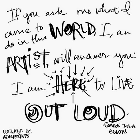
An Artist’s Quote
Comments Off on An Artist’s Quote
Tagged illustration, Inspiration, typography
A Change of Pace
I'm writing from Texas today. We're on the second leg of a pretty long tour of the U.S. while we introduce our baby boy to the extended family. This long trip is forcing me to explore other facets of my work, and I think it's to my benefit. Since my sewing and knitting machines stayed in Germany, I've focused more on knitting, illustration, and fonts...
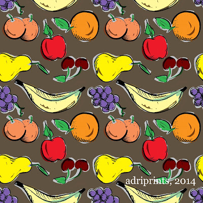
I've also been taking online classes on surface pattern design. My most recent class was through CreativeLive and was the Pattern Design: From Hand to Screen to Surface with Molly Hatch. It was a refresher course for me since I remember learning one of these techniques when I did ceramics at University of Miami. We learned some of these techniques when we were making tiles... like physical tiles from clay! It's great to know that these age-old techniques can be translated to digital form.
Here's the rough from the class...
And, in the fonts world, I've been learning more about kerning. It's a weakness of mine. When I first ventured into typography and designing fonts, I didn't know much about kerning and it shows in my early fonts. So, my goal whilst traveling is to re-kern my old fonts. Wish me luck! It's quite a tedious task to say the least.
In the knitting world, I'm working on a fairisle design for babies. Here's my swatch:
If you're in Munich in February, I'll be teaching a class on fairisle knitting at the local yarn shop (contact me for details if you're interested!).
I've also been taking online classes on surface pattern design. My most recent class was through CreativeLive and was the Pattern Design: From Hand to Screen to Surface with Molly Hatch. It was a refresher course for me since I remember learning one of these techniques when I did ceramics at University of Miami. We learned some of these techniques when we were making tiles... like physical tiles from clay! It's great to know that these age-old techniques can be translated to digital form.
Here's the rough from the class...
And a more refined version I worked on via Photoshop:
And, in the fonts world, I've been learning more about kerning. It's a weakness of mine. When I first ventured into typography and designing fonts, I didn't know much about kerning and it shows in my early fonts. So, my goal whilst traveling is to re-kern my old fonts. Wish me luck! It's quite a tedious task to say the least.
Comments Off on A Change of Pace
Tagged fair-isle, illustration, starting, travel
Quickie Illustrations
From mid-July to this past Friday, there was a draw-along challenge kind of thing leading up to an art opening with the local Munich Artist's Group. I dedicated a meager 15 to 20 minutes of time to these illustrations and I sadly couldn't keep up with the full 30 days. But, I was happy to be illustrating again, and I did have a few really nice ones at the end of it.
Here is my favorite...
And these were alright, too...
Here is my favorite...
 |
| illustrate a place |
And these were alright, too...
 |
| self portrait |
 |
| favorite animal - chameleon |
 |
| a word - lackadaisical |
Comments Off on Quickie Illustrations
Tagged illustration, quick
Correspondence
I think the guy at the corner post office knows my name now-- which is great! That means I've finally finished and mailed all the stuff that should have been sent out ages ago.
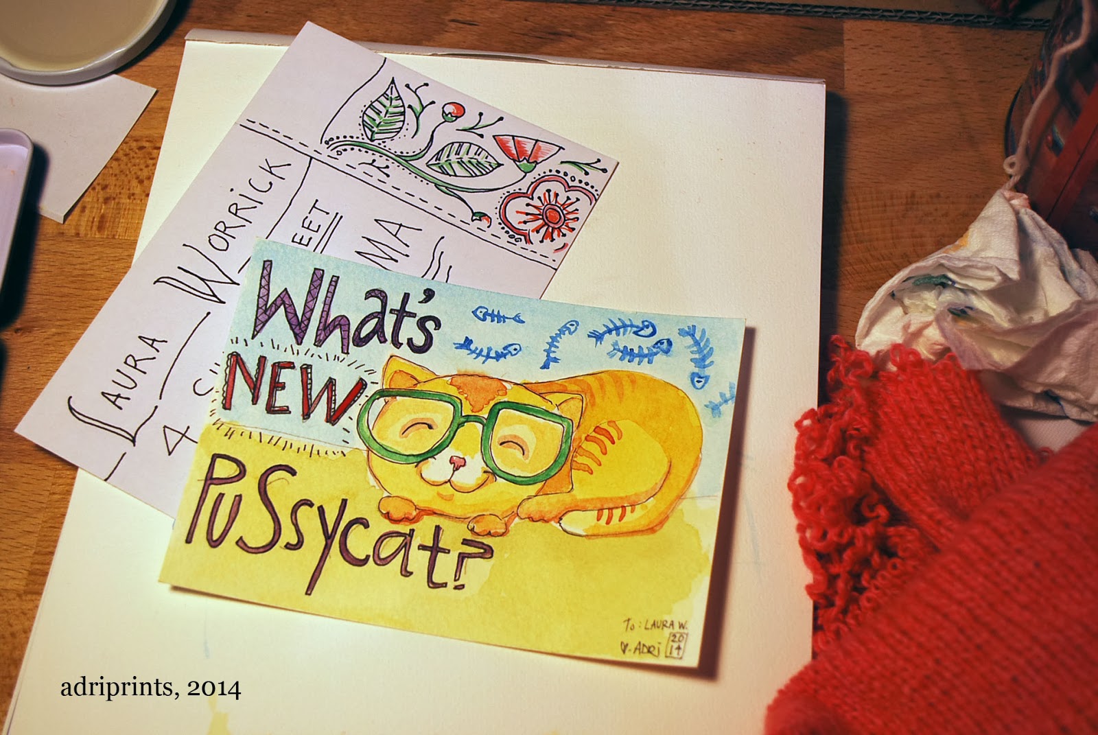
You already saw the finished baby blankets in the previous post, but I also finished a few other things! A friend and I are doing a hand-lettered mail exchange. Here's my letter to her:
Sorry, I know her address is covered, but underneath it's lettered really nicely. I wanted to respect her privacy, you know?
I also did this hand-made facebook exchange thing and I finally got around to making the items!
First, there's a hand illustrated postcard to a friend of mine. It's an inside joke, but for the life of me, I can't remember the punchline. All I remember is that many moons ago, I made my friend, VJ, a silkscreen t-shirt with the word "beefmaster" on it and a piece of toast. Here's the concept revisited:
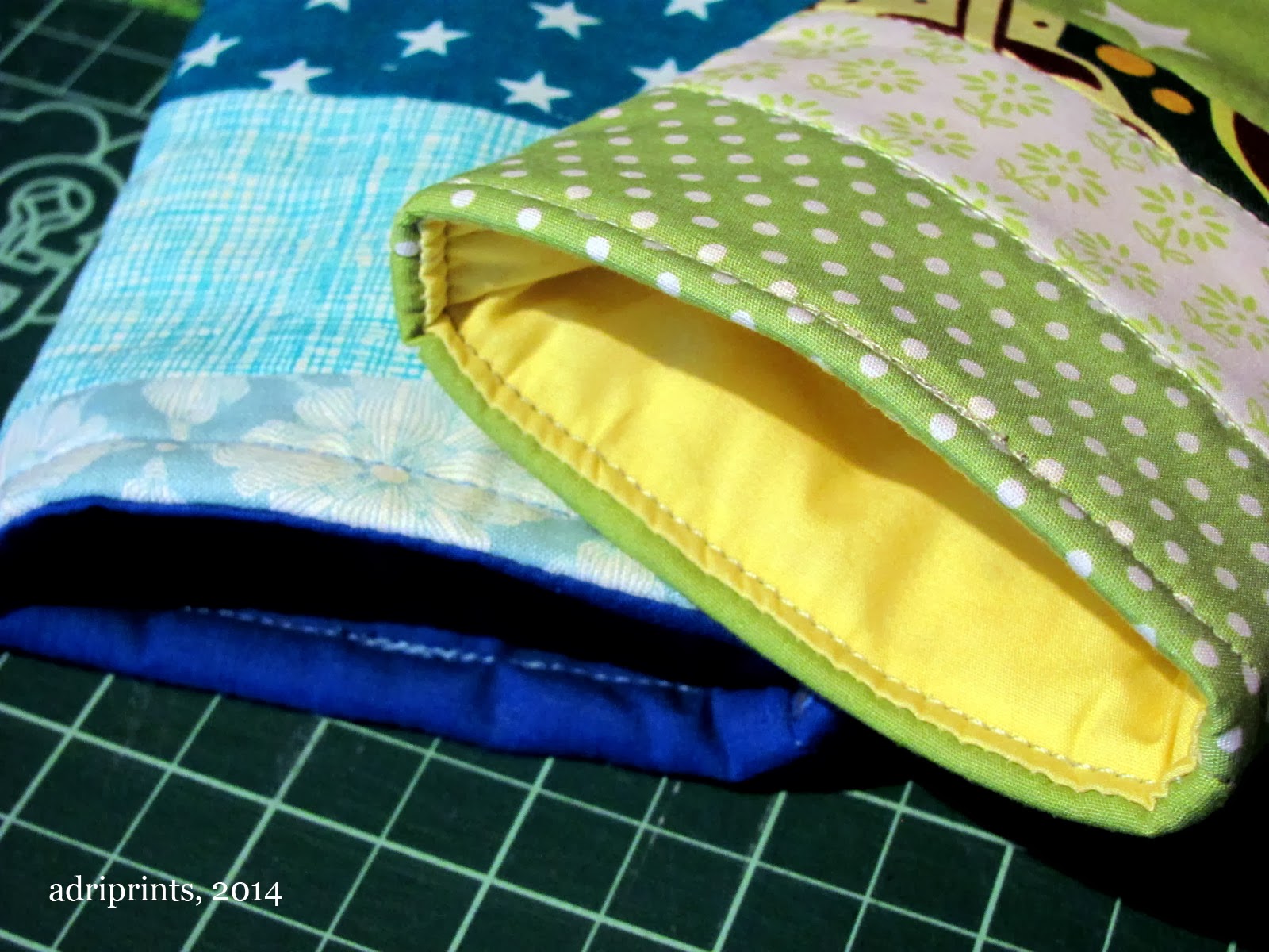
Then, there are the eye-glass cases I made from quilting scraps for two friends of mine who live in sunnier locations:
They were made using a simple cardboard template that measured 9" x 5" and then quilted and sewn together. Is anyone interested in a tutorial? Let me know in the comments if you are.
And finally, in the mail I got my contributor's copy of KnitNow's Issue #30 with my pattern on the cover!
What a crazy awesome issue! It has so many lovely extras like charts for colorwork lettering and magnet strips to keep track of charts. Very handy! And a lovely insert with cute winter accessories. This issue has lots of quick knits at various skill levels, and it's chock full of knitted lovelies in general. I feel so lucky to have been a part of the gang for Issue #30!
Comments Off on Correspondence
Tagged illustration, quick, Sewing, stationary, thanks
Up for Auction: My Print, La Semilla
Many of you have been long-time followers of my blog, and have probably wondered where my moniker "Adriprints" comes from. I don't think I've ever explained it here on the blog. When I was a student, I studied printmaking. Printmaking was the medium I chose for most of my illustrations.
I especially love(d) etching, drypoint, and most intaglio techniques. I would draw directly on the a copper or zinc plate or transfer illustrations and then work with acid, scribes, rockers, and other tools to develop the plate's surface into an ink-able plate that I could run through a press.
Wherever I was, in every stage of my life since then, if I found a printing press nearby, I'd print. Once I moved to Germany, I found a press, but it was 1.5 hours to and and 1.5 hours back, leaving me with only an hour or two of working time... it was a bit too stressful, but I did manage to print a series even with the limitations. So, eventually I turned to more immediate mediums like watercolor, graphite, and ink... and then sewing, knitting, and the fiber arts.
Back to the present...
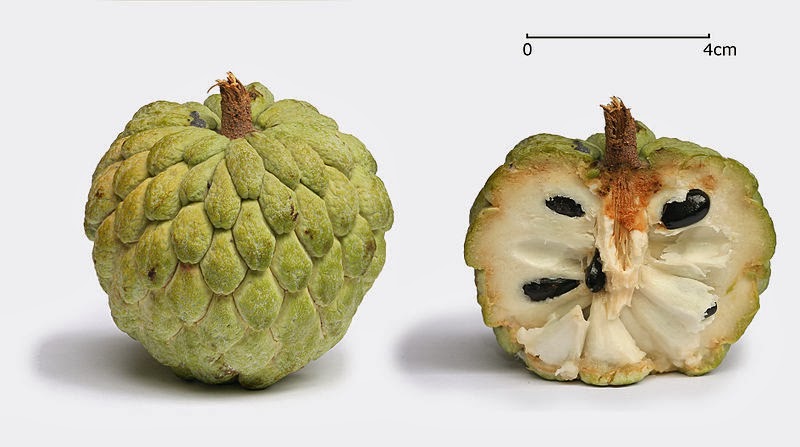
The print that's currently up for bidding is called "La Semilla" and it's from a series called "Los Anones". It's a pretty personal topic since this series ties closely to my family and my origins. "Los Anones" was the name of an orchard that my family owned in Cuba. One of the great-uncles was a world traveler and brought back seeds from his travels and would try to grow them in the orchard and this plant, annona squamosa, did really well in Cuba and that's how the orchard got its name. But, here's the thing, I didn't grow up in Cuba. I grew up in Florida since my parents were political exiles. The only physical tie I had to my parents' and grandparents' roots were literally from a tree in my backyard growing up. It was the only one I knew of its kind - a single anones tree.
The print is a botanical illustration of the seed of an anon. We tried planting the seeds from this tree, but they didn't take. It hasn't flowered in a while, and I have to ask my mom to see how it's doing.
In any case, my print is now up for sale. It's the first time I've tried anything like this where an audience can bid what they like for my work. It's left me a bit vulnerable to say the least. If small prints are up your alley, and you'd like to make a bid - it's open to worldwide bidders - you can see the auction here.
| one of my prints, cicadas |
 |
| a plexiglas plate with drypoint illustration on it (photo by Emmy Horstkamp) |
Back to the present...
| "La Semilla", photo: Emmy Horstkamp |
 |
| photo: wikimedia commons |
In any case, my print is now up for sale. It's the first time I've tried anything like this where an audience can bid what they like for my work. It's left me a bit vulnerable to say the least. If small prints are up your alley, and you'd like to make a bid - it's open to worldwide bidders - you can see the auction here.
Comments Off on Up for Auction: My Print, La Semilla
Tagged illustration, printmaking, promotion
New Colors!
For about the last 15 years or so, I've had the same travel watercolor set. I had taken it with me on trips here and there and all over. Then, without even noticing, it was gone! I looked for it to take with me on the last couple of trips, and thought it was just misplaced. But, after a pretty comprehensive search through the earlier part of this week, and no gold, well, I gave up the old set for lost.
I was bummed. Really bummed.
Then, I went to the art store with a friend and she went to another part of the store while I asked a shop employee for recommendations on a suitable replacement. The set nearest to the one I lost was a bit too compact and had a water reservoir attached to it which was cool, but it was so limited in pigment pan space, that it just wasn't right. She then showed me the set she has herself. It's a set with 12 pans, but with space for 24 and fits a brush of regular size, too! I was sold. I bought two additional pans from their Horadam line - Manganese violet and a Dark red.
I don't know about you, but when I was a kid and received a new box of crayons, I tested out each color... So that's what I did here.
Yay! New watercolor set!
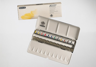 |
| Schmencke Set 75412 AKADEMIE® Aquarell, Solid metal box with 12 half pans and space for 12 additional half pans |
And, in 15 years, watercolor pans have changed a lot! These pans are so much smoother and less grainy than before. The pigment cakes dry way faster, too, and the colors flow much more like ink. I'm kind of glad the old set retired itself. Otherwise, I might never have known!
Comments Off on New Colors!
Tagged Color, illustration, Inspiration, quick
Playground Memories
Comments Off on Playground Memories
Tagged illustration
Illustration Friday, Jungle Theme
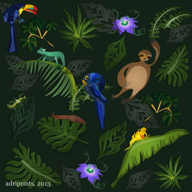
This week's Illustration Friday theme was "jungle" and I was back at the drawing board early in the week and then again mid-week. I was back and forth on what to do, but then I saw this poster by A.M. Cassandre, the French illustrator, painter, and commercial artist.
I really like the airbrush texture in his work, and wanted to see if I could somehow capture a bit of the grittiness in my own digital work. Some of what bugged me about the spring horse illustrations of last week was that I couldn't capture the right texture.
Another thing I wanted to address was the lack of variety in the spring horse illustration. It felt a bit blocked. Maybe it was too much time on the digital work from the get-go, and not enough sketching. This time, I had a goal of illustrating 20 different elements in one illustration. I got close... I illustrated 16 different elements. Baby steps! For subject matter, I picked my fave jungle creatures and rolled with it. This sounds corny, but I tried not to try so hard.
Okay, that's all for now!
Here's my sketch in case you wanted to see how this started.
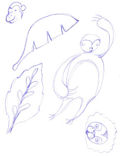 |
| one of the sketches for "jungle" |
Comments Off on Illustration Friday, Jungle Theme
Tagged color challenge, illustration
Logo Summer
Here are a few logos I've designed this summer...
For a website called Knitting Rose Yarns. The owner hand-dyes her own line of yarns, has a podcast, and is quite active in the fiber arts world. Knitting Rose's owner, Lise, shows her yarns at conferences like Stitches Midwest, and fiber arts festivals in the southwest.
Lise, the owner of Knitting Rose, and I were working with some very specific ideas inspired by the text of her company's name and the resulting logo is one I'm really happy with.
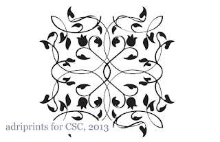
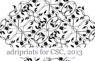
Another logo from this summer is for a sex coach. We wanted the logo for CSC, to be friendly and approachable, but serious. We wanted there to be an openness to the botanical elements, and a damask-like symmetry to the logo so it can work alone or as an all-over pattern.
This logo was a lot of fun to make because I hadn't made a repeating pattern in a while. I love tinkering with the elements and seeing what happens in different repeat motifs.
For a website called Knitting Rose Yarns. The owner hand-dyes her own line of yarns, has a podcast, and is quite active in the fiber arts world. Knitting Rose's owner, Lise, shows her yarns at conferences like Stitches Midwest, and fiber arts festivals in the southwest.
 |
| Adriprints for Knitting Rose Yarns, 2013 |
| Knitting Rose Yarns website with new logo |
| Knitting Rose Yarns website with new logo, podcast with logo |
Lise, the owner of Knitting Rose, and I were working with some very specific ideas inspired by the text of her company's name and the resulting logo is one I'm really happy with.
Another logo from this summer is for a sex coach. We wanted the logo for CSC, to be friendly and approachable, but serious. We wanted there to be an openness to the botanical elements, and a damask-like symmetry to the logo so it can work alone or as an all-over pattern.
This logo was a lot of fun to make because I hadn't made a repeating pattern in a while. I love tinkering with the elements and seeing what happens in different repeat motifs.
Comments Off on Logo Summer
Tagged design, illustration, logo
Cover Illustration, published
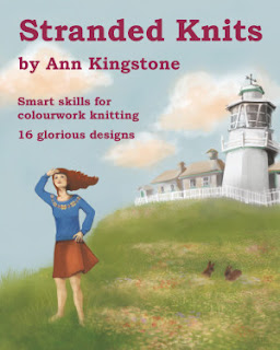
Yay! I can finally publicize the cover illustration I did for Ann Kingstone's book Stranded Knits!
The book features some really lovely stranded color-work knitted jumpers and accessories.
Comments Off on Cover Illustration, published
Tagged illustration

