Tag Archives: illustration

Surface Design, Botanical #1


After taking some general online courses on Surface Design, I came upon this one by Bonnie Christine on Skillshare.  I started this project in late February, and kept a lot of detailed notes on my progress.  Can I tell you how much I've learned in the videos from Bonnie Christine's class?  It's crazy!  I have been using Adobe Illustrator for over 10 years, and I thought I knew my way around, but I learned so many new tricks in this class that I hadn't ever even thought to try!

I was humbled by the class and how much I have left to learn about design and my favorite software.

Also, as you know, I've spent all of March working on MATS projects.  So, in between my projects and the fast-pace of each week, I've been tweaking and applying my new skills to this pattern repeat.

Here's what I did for the class:


And here's the diary of my entire process...
February 23, 2015
Choose a word, short phrase... Bloom?  Blossom?  Botanical?  Not sure yet, but I think I'll go with one of those.
Favorite things in nature... red squirrels, muscari azureum (grape hyacinths, and also bluebonnets and bluebells), new leaves, buds of flowers, dogwood blossoms, peonies and round blossoms, cacti, lithops & succulents, daffodils and narcissus, orchids, etc.  Bright saturated colors.

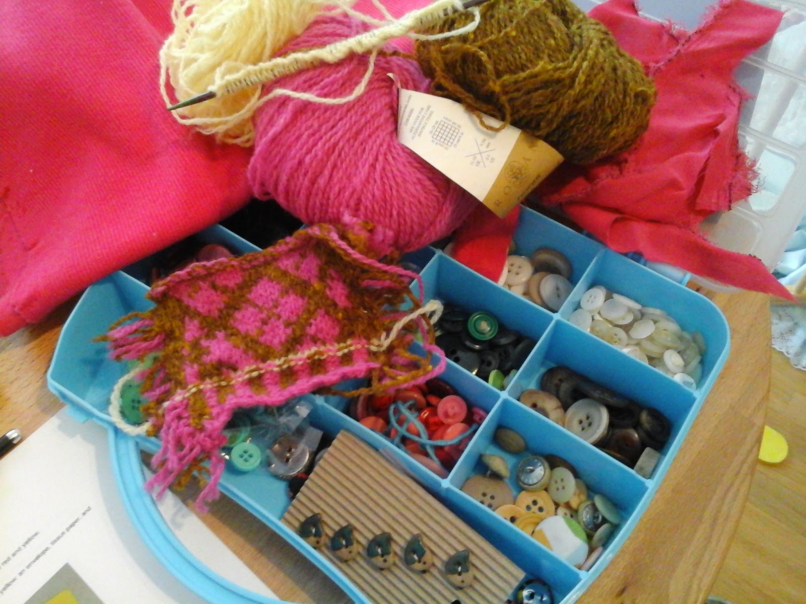
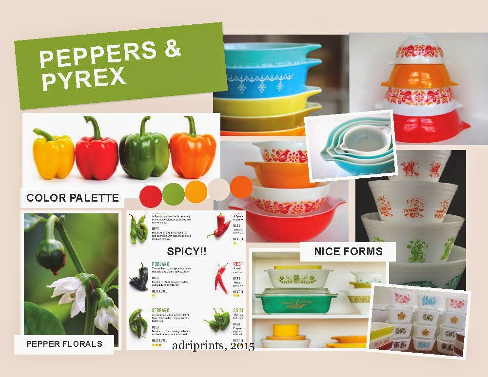
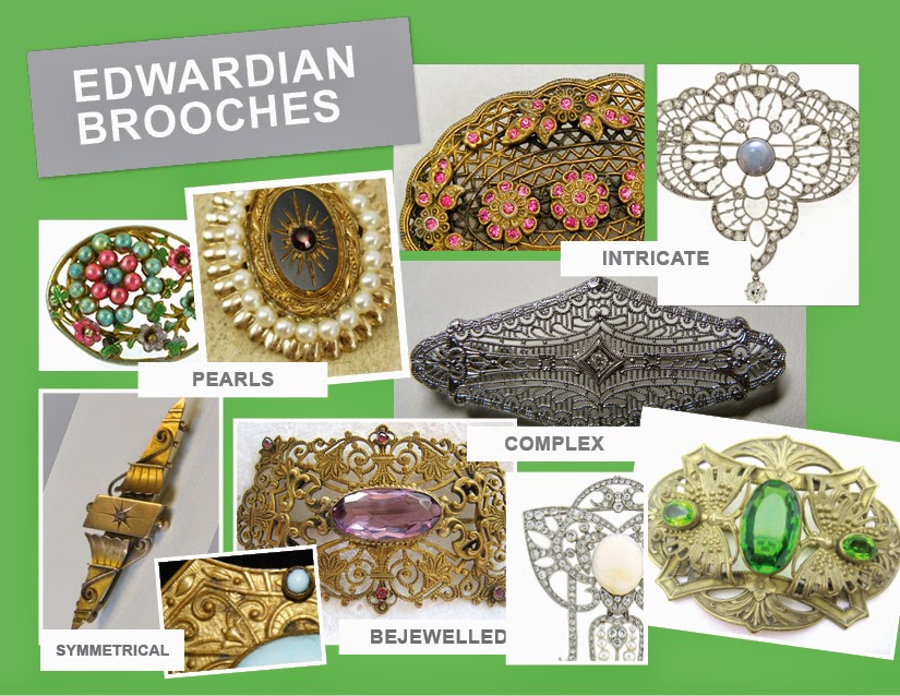
1 colorful photograph (for palette) & 3-5 photographs (thematically related, to draw from) -- See mood board labeled "Botanical #1".  I love this bouquet I found on Pinterest.  And, I found other beautiful photographs on several photography sites.  I'm personally not that great of a photographer and so I looked on Pinterest, Flickr, and used keywords of my favorite things to find inspirational photographs.  

Mood-board Photo Origins: I searched for the origins of the peonies bouquet, but to no avail.  The leaves, curled seed pod are from photographer Alan MacKenzie a very talented wildlife photographer.  The daffodils and muscari azureum on the top right of the moodboard are from Better Homes and Gardens magazine.  And the red squirrel is from Birds in Berlin blog.


February 24, 2015: Choose 10 - 15 simple/med complex sketches  I'm thinking the squirrel, hyacinths, and the succulents will be my complex elements and perhaps I'll simplify everything else into 1 or 2 colors.  Maybe I'll use just the filled-in outline for some, and/or the line-art.  Time to play!

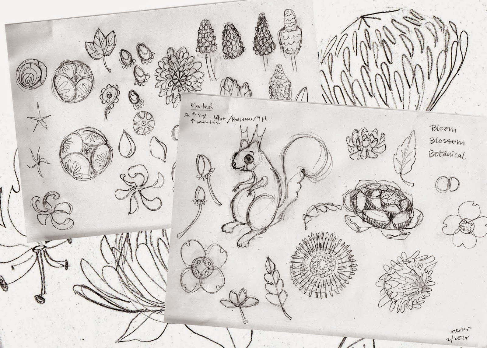
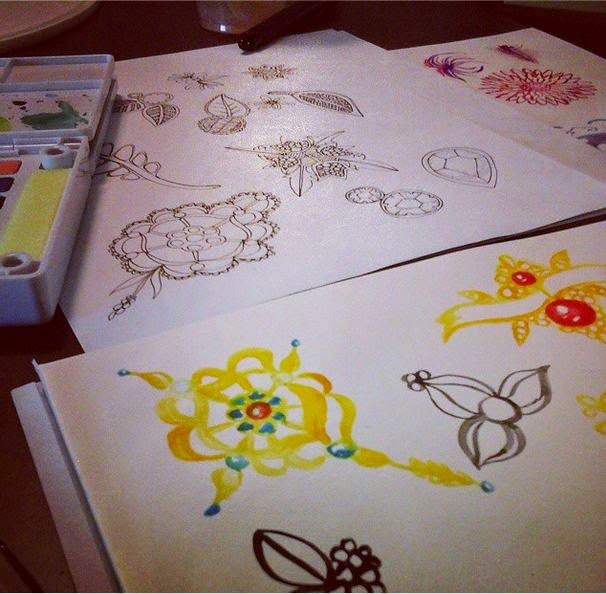
February 25, 2015: Digitizing the sketches
This was somewhat tedious, but in a zen-like way.  It's digital tracing using a bunch of different techniques.  Some I used my own custom brushes in Illustrator, then expanded the stroke.  Others I used the blob brush as instructed in the videos.  Then Others I used a black marker and filled in areas using my tracing table, and then scanned, and did "live trace".
March 1, 2015: Simple Repeat
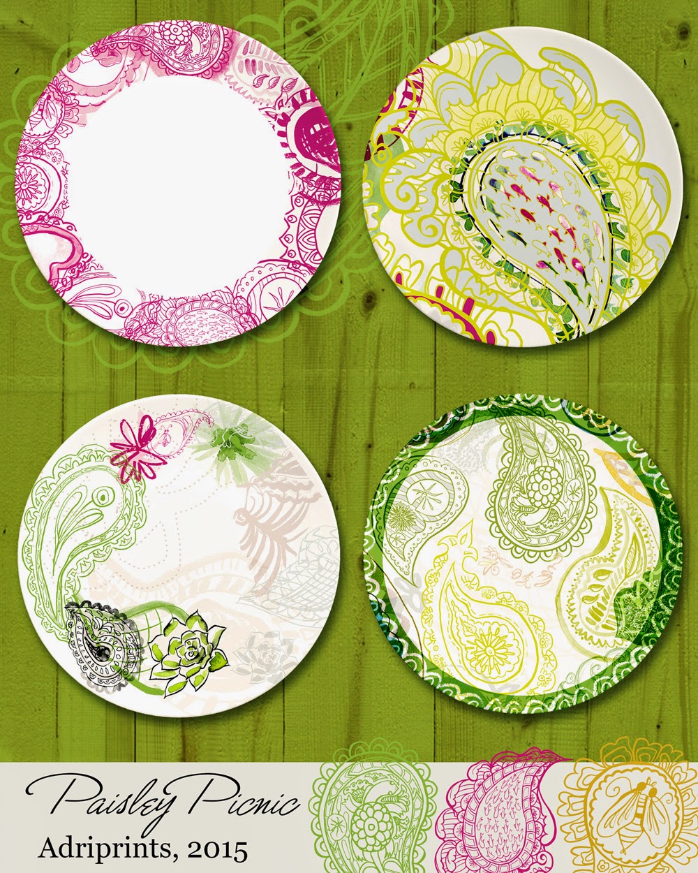
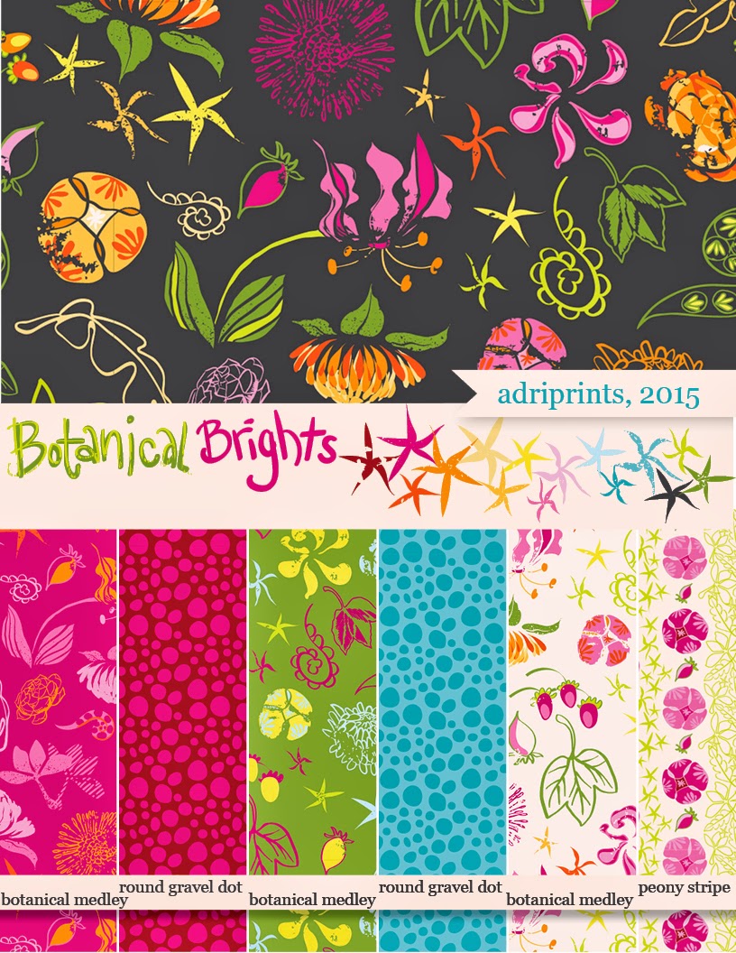
Alright.  I have to say it.  This class is ROCKING my world!  I just tested my simple pattern repeat, and using my palette, I "recolored" the artwork.  To my amazement and wonder, I now have 3 colorways that I absolutely love.
What do you think?

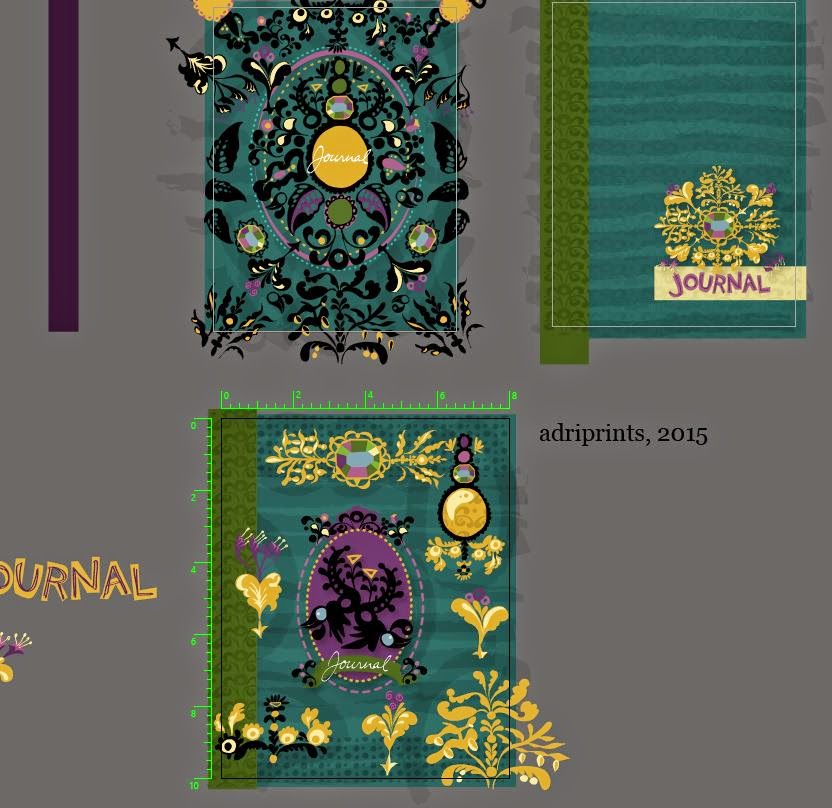
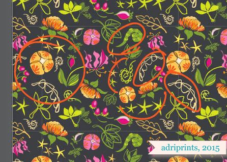
March 4: Complex Repeat WIP  
Here's where I am with the motif for the complex repeat.  I've struggled a bit to get it where I want because one of my goals was to add texture to my work.  So, I made some textures, scanned them, etc. and got them to be vector-friendly.  Then, I learned that you can't make a pattern repeat from something with a pattern in it... so be sure to expand all your elements before trying to make a pattern from it!  I learned that after a while of trying to drag it into the swatches panel with no success.  Oops!  Lesson learned!
March 18, 2015: Complex Repeat WIP The past few weeks I've learned a few things about repeats.  I bought and read several of the books that Bonnie recommended (mastering the art of fabric printing and design & the field guide to...).  I also learned some new work-flow for Photoshop and back to Illustrator in order to add texture and correct alleys and holes  and too easily recognizable repeated motifs.

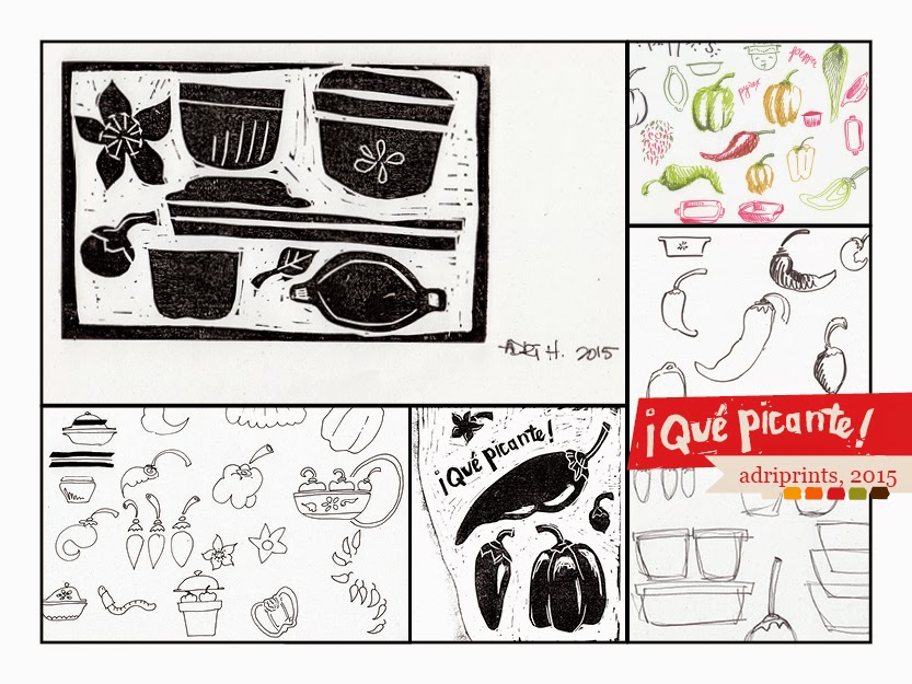
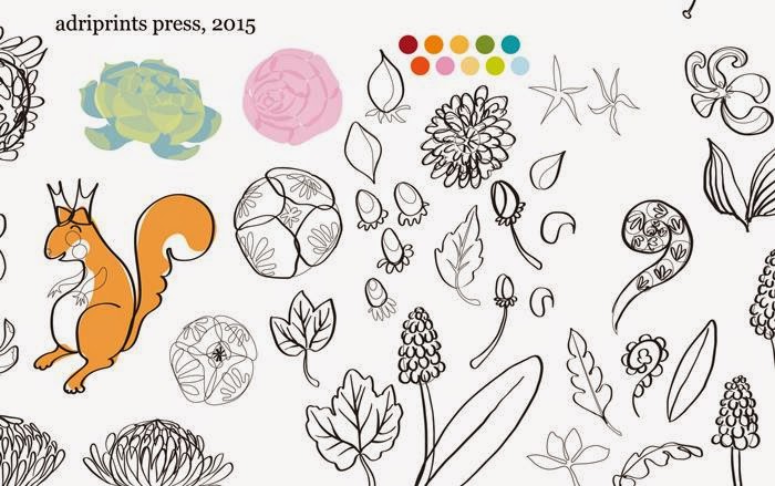
Also, I went back and re-inked some of the original motifs that felt a bit lacking, and here are the newly inked icons.

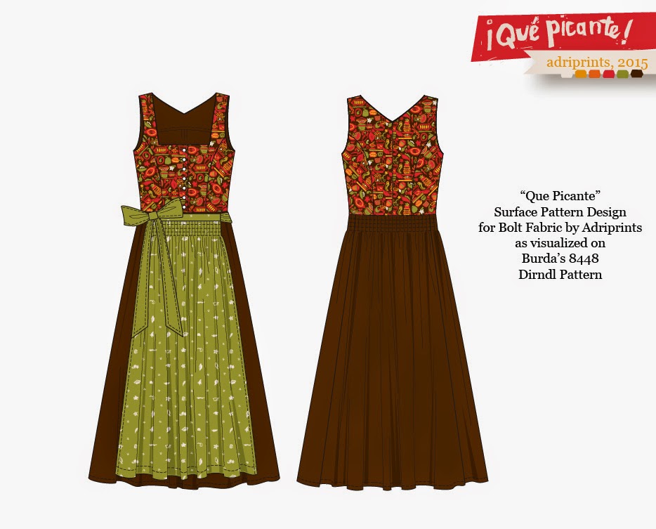
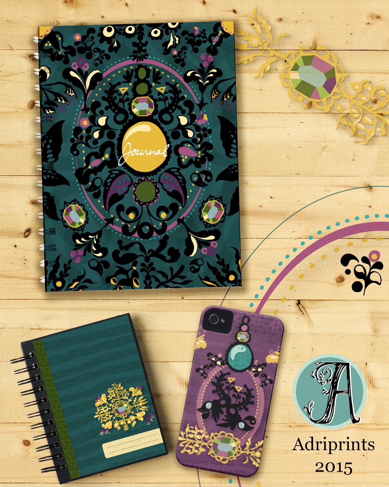
March 30, 2015 And, if you look at the version I submitted, you'll see the versions above were the ones I used.  

The next steps for this project:  
  • add more geometric/abstract patterns
  • refine the color palette
  • find a fabric manufacturer who would like to work with me to print the collection!


MATS A, Week 4 Wall Art

This week was a very freeing experience for me.  Before this year's Bootcamp and MATS class, I hadn't done a proper painting in forever.  I was a scenic artist for half of my 20's and had painted giant scenic backdrops, kitschy scenic flats, furniture, design illustrations, etc.  And, this week felt like I was taking all that experience, plus a distinct perspective as an adult and I was able to just let it flow.

Here is the final mocked up in a frame...


The assignment called on several specific requirements - choose a pair of colors based on our zodiac sign, use collage, include text.  My sign corresponded to the colors pink & yellow. I was really excited about pink & yellow, but truthfully, I would have been excited no matter what the color combo.  I love getting direction and parameters to work within, and I also love color.  Yay color!


Next we had to collect 2-D and smallish 3-D items that were in our colors, a color scavenger hunt!  My studio is lightyears beyond the mess that it was last year.  I've tossed so much, and even then, I managed to have no shortage of things in these colors.

button collection and swatch for gloves WIP
ancient i-pod and lovely silks
And, once I figured out how I was gonna work, I was off to the races.  I didn't have a large enough canvas so I worked on five little canvases that I would seam together digitally.  Dekopatch, gesso, matte medium, acrylics, markers, pens, post-it notes, paper, rice paper, fabric, buttons, tissue paper, cardboard, and stamps... to name some of the things I used to make this piece.  While things were drying, I rotated the canvases and made linocut plates.  I had a really good flow going, and I was listening to my fave tunes on the ancient i-pod.

lino cut and watercolor dots
The next part, the digital seaming, was a bit more tedious, but it allowed for a kind of freedom that I hadn't had before with paint.  The ability to "undo" is an amazing weight lifted off one's shoulders.  The fear of making the next mark is completely gone, and it was great!


This project was tons of fun, y'all.  Tons.

MATS A, Week 3 Picture Books

This week was a real eye-opener.  I've illustrated for books before, but never children's books, and that was the big theme this week.  It was exhilarating.  I had so much fun illustrating the goats and then the trolls, but I was left a bit sad afterward.  I want to keep going... I had so many ideas that I didn't get to illustrate for this one!!

Let's get to the meat here... Here's my image.  I think it's fairly easy to figure out which fairytale this particular scene represents, but just in case... it's from "The Three Billy Goats Gruff".  It's when the littlest goat first meets the troll.


During my research phase (all of 30 minutes), I found out that goat farmers don't like calling male goats "billies" and they prefer the intact male goats be called "bucks" or "rams."  There you have it!  And, this story is really, really violent!  I cannot imagine illustrating the traditional story for super young kids.  I left that to my peers and they did some lovely innocent twists on the story.  I took the assignment as-is, and my direction aimed toward a bit older audience (kids maybe 8+ years old).

I thought it would be really cool to do a comic/graphic novel-type hybrid with the picture book and proposed inserting two panels to illustrate the fear and panic of the littlest goat, but my peers thought it took away from my illustration. The leftmost inserts would have been black and white and shown the hooves of the little guy as he first steps onto the bridge. Dramatic!!  I'd love to hear what you think!


I found that my scenic art background came in really handy in this assignment.  It's what I enjoyed the most.  I loved painting the background and creating the forest and the waves.  AAND, I especially loved doing the troll.  So much fun!  His back absesses and hair and six fingers, yellow teeth, etc. etc.  Had I more time to develop my characters I wanted to add a bat and mushrooms, dead animals, etc. to his fur.  So many ideas!

And, for my fellow artist and illustrator friends who are curious about my process...

Here's are a few WIP screenshots...


And the character development phase...

These are the two fave pages of goats.  There were maybe 10 or 12 sheets full of goats. :D

"Friends" or maybe "Three's Company" meets "3 Billy Goats Gruff":

Baby Goats!!

This week's course materials were really great. The interview with Mike Lowery reminded me that illustrators are people.  Yes, I know, I'm an illustrator and also qualify as a person.  But, sometimes we make such a pedestal out of our dreams that we forget the daily steps it took for regular people to get there!  There was also an interview with a Hatchett Book art director which was really great for learning the process by which picture books become a reality.  It sounds lengthy, but I know a thing or two about that (see my knitting designs)!

Aaaand, this week's favorite for me was actually a bonus by Lilla.  She included this really great worksheet about dealing with self-critique and envy.  I'm constantly at odds with myself.  "Is my style good enough? Marketable enough?  Is it even a style?" All these doubts!  It's great to hear I'm not alone.  Although, it would also be great to have actual answers to these questions. HAH!  Whatever the case may be, I look forward to "Wall Art" which is next week's assignment.

MATS A, Week 2: Home Decor

Review of Week 2, MATS Part A which focused on Home Decor.


We started the week with Monday's Mini Assignment which was "go crazy with paisley!"  And I did!
I went ahead and went crazy doing different graphite illustrations on wacky paisley motifs thinking we were going to do bedding or bathroom textiles, maybe even upholstery or a room.  I imagined paisley swamps and bogs and that's where my head was when I started illustrating for this project... some kind of paisley pond world.

And then we got the main assignment: plates.  One of the worksheets that came with this week's assignment had this very important question when thinking about plates: Would you eat off of it?  My stomach had a sinking feeling when I came to that question.  It had never crossed my mind that we'd end up focusing on plates!  Some of my illustrations were not really food friendly... frogs eating flies, hungry anyone?!


It is a tough question, isn't it?  If it's a decorative plate, then no, I wouldn't eat off of it.  But, my utilitarian tendencies wouldn't let it go at that simple solution.  I couldn't just design decorative plates.  I don't own any purely decorative plates, and it was an important aspect of this week's project to be your own customer.  I worked through the designs until I felt that these were a series of plates I could see myself picking up and serving desserts or summer drinks or a festive picnic meal.  I learned this about myself - I am picky.

Here's the progression of one of the plates, the upper right one in the layout.

And then of course, there's the real-life stuff that kind of stressed me out.  We were traveling and we had no internet access, and I bought a hot-spot card to use the city's wi-fi, but it was spotty at best. Little dude was finding everything exciting and did not want to sleep or nap, which made it a bit of a a time crunch. We were at this ridiculous cloister atop a giant hill in a tiny town in Germany, and it was beautiful... but technologically desolate.

Thoughts on Week 2 Course Materials

With this week came a wonderful set of worksheets that had some great questions about this market and specifically plates.  These are the kind of questions that get you un-stuck when you've made progress, but aren't "finished".  I am treasuring them.  They're the "Hey did you think about this or that?" aspect of illustration.  I tend to sketch quickly and get things into the computer and then find myself all self-doubty at some point.  Those questions are invaluable!

The interview this week was with a Crate + Barrel art director and it was interesting to read how she makes decisions on artwork.

So, is the Home Decor market for me?  I think it could be, but I still like the puzzle aspect of bolt fabric better.  Home Decor felt like the ocean to me, and I like knowing where the edges of the pool are when I'm illustrating.  Maybe I'll feel differently depending on the item.

Also, a special shout-out to my fellow MATS-ians.  Thanks for your help pushing me forward this week!  I needed it.

Picante Dirndl

When I was a kid, I loved comics.  I was a big fan of the "what-if" and alternate reality issues that comics would sometimes print.  This idea of "what if's" popped into my head as I posted about this past week's MATS Bolt Fabric Assignment, and it wouldn't let go.

What if... I did make a dirndl out of my own fabric?

I imagine it looking like this!  I used Burda's Dirndl Pattern 8448 as the basis for this visual mock-up.


I think that would be really unique to wear to Oktoberfest 2015!

Please note that I do not have any affiliation with Burda or their patterns, and I do not represent Burda or their parent company in any way.  Just an illustrator and DIY-er here.

MATS A, Week 1: Bolt Fabric

The first week of MATS (Make Art That Sells) Part A went really, really well.  I was so anxious and scared to begin with, but I felt right at home illustrating the mini, and then later the actual assignment.  My fellow classmates were super supportive, and their work is really great!  It's awesome to see what others are doing and it helps me to figure out what to tweak next.  I see how they handle certain elements within a design and it sparks a solution in me.  Lots of zeitgeist, enthusiasm, feedback, and visual inspiration!

I also like that the turnaround times are short in order to force me not to spin my wheels.  I have the tendency to overthink things if given too much time.  The deadlines of the course plus the unpredictability of the baby's toddler's schedule make for a nice sense of urgency that makes me productive!  This past Thursday night I turned in my final, and here's what it looks like...


This was the layout that I turned in, and I'd like to change certain elements moving forward, but I'm happy with the overall direction I chose.  Our mini theme was "pretty peppers and pyrex" and then the big assignment was "vintage kitchen" as the target niche.  I kind of tweaked the theme to "I love Tex Mex please join me in celebrating my love for enchiladas through the lens of 1972."

As many of you who know me already know, I lived in Texas for a few years and my husband is Texan.  His family live in the southwest and we visit nearly every year.  Here in Germany, Tex-Mex can be found, but it's not the same.  When I visit TX and NM, the food is something I enjoy very, very much (I nearly went with vintage + BBQ!).

Interestingly enough, living in Germany for so long seems to have rubbed off on me.  One of the coordinates ended up looking like one of my favorite traditional dirndl fabrics (the green/white one on the lower right).  I think it would be really cool to have a dirndl with chiles on the bodice or apron!!

Process
Mini: peppers n' pyrex
Original Mood-board


Roughs
first linocut in over 10 years!


To give you a breakdown of what I was working with, I scanned in my images and isolated roughly 80 to 90 individual icons. Once the additional category of "vintage kitchen" was given, I shopped among them for the most appropriate ones.  I had already digitized them, but not yet colored them.  Next, I added textures, finessed the little details... but there's always more to do.  If anything, I've already learned that.  The details make or break the illustration.

Thoughts on Week 1 Course Materials
I found the break-down of the assignment to be very helpful.  I love the act of chunking the work into tasty morsels, and so the structure of the class suits me well.  Most days we had a post to read, an interview to watch, skills to learn and/or industry tips and tricks to absorb.

The information given in the class materials is really specific and valuable.  This past week there were even additional workshop materials from the Art & Business of Surface Pattern Design course that I considered taking.  I think I'm in the right place because I already have a pretty good understanding of the technical aspects of making a repeat through my background experience with Illustrator and the Creative Live, Skillshare classes from Bonnie Christine and Elizabeth Olwen, and the books I read on pattern design.

But, the interview with an industry professional was invaluable.  So was the style analysis worksheet and Lilla's advice.  In short, I'm so glad to be taking this course.  It's exactly what I needed!

MATS Bootcamp #2 February Assignment

Wow, this month has been huge! We're well over halfway through February, and I feel like there's just so much creative juice burstin' out of me with these assignments.  It didn't happen instantly, though.  Our mini assignment was to create a scenic plate.  I had lots of ideas for plates and analyzed the given inspirational plates to see what it was about them that I liked.  I drew lots that I'd love to see on holiday plates or a breakfast bowl of some kind.


And then, sleight of hand, Lilla and her team of magicians turned that mini into the real assignment which is wall-art on wood... oh, and please use real paint.  C'mon, be a good sport!
Paint.
Paint.
Paint...

Did I ever tell you guys I used to be a scenic artist?  I was.  In addition to Printmaking/Illustration, I studied Set Design and Theatrical Production as an undergrad and I worked at a couple of theatres painting backdrops and props.  I have painted a lot of things in my life, but it feels like another alternate-reality version of myself that did that work.  The last time I used any opaque paint in my own work was well over ten years ago.  Argh!  I can do this! Why was I so hesitant?

For some weird reason, I had a kind of aversion to using acrylic in my own work.  In my mind, as I painted these most recent MATS assignments, I recalled painting super cheesy assignments for learning grey-scale and color theory.  The awkward re-working of straight lines and forced photo-realistic depictions of things.  Ugh.  I remember one particularly silly illustration where the goal was transformation, and I did a pair of scissors > lobster.  I think I'd like to attempt that one again.  Ah well.  Eventually, I took to the acrylic with a love-to-hate-it kind of relish. :)  Why not embrace the discomfort?

Here's what I turned in...


And, here are the rest of the work on wood I painted!


Side Note: If you're in Germany and are looking for these wood plaque type rounds, they're called "holzscheibe" and you can find them at florist's shops (online in my case).

MATS Mantra Competition

This piece was a competition piece for MATS (make art that sells) mantra.  The goal was to encompass the feeling you get when you're taking a MATS course.  And, although I didn't win the big prize, I was able to use Illustrator in a new way for me.

See, I've been trying to nail down my style, and I absolutely love working digitally, but it lacks the grittiness and texture of my hand-illustrated and painted work.  So I've been trying to merge the two elements somehow (flat color + texture).

Here is what I came up with:


And this is how I got there:

I started out with pencil and ink sketches.  I had about 30 different thumbnails, and picked the heart-sun one because it was the most visually engaging.  

I refined the image, traced it into Illustrator, and using a light-table I used overlays to play around with text.

Here is the image before I added text, texture, gradients, etc.

I almost stopped there... but it needed texture!!  You can see the hand-written text below.  I had several versions of each snippet of text.  Lots of versions of everything!


And finally, I went in and "texturized" the background.  It was a weird feeling to paint the background with texture and grit, but I think it works for this piece.  And, even though I didn't win the big prize, I did win a free entry into MATS Global Talent Search!  Woot!!


MATS Bootcamp #1

Our first Make Art That Sells (MATS) Assignment Bootcamp (whooh mouthful!) assignment was to brainstorm with Edwardian Brooches...and then, we were to turn our musings into a journal cover.

This is what I came up with for the assignment:


Here's how I got there...

We got our Mini Brief and after preliminary research, I started sketching like crazy.
sketching like crazy!

ballpoint pen crazy sketches
You can probably already see which direction I chose to follow in the end, but at first I didn't know.  I went in a couple of directions at once. I wasn't sure which idea would work, and I brought some of the sketches onto my tracing table.  Other sketches I painted over, others I traced with felt-tip pen, but I scanned everything first -- just in case it didn't work out.

In the end, I felt I needed to pick a style.  My sketches went generally into three styles:
1) swoopy intricate
2) crunchy colorful painty
3) slightly naive line-art

I went with "swoopy intricate" and then I created two moodboards: an observational one from the research and a style guide to help reign in my madness.


FYI: These mood-boards were from a template from a really helpful Skillshare class with Elizabeth Olwen.  The class really helped me with workflow and technical tips with Illustrator.  I can highly recommend it if you're looking to figure out how to make a repeating pattern in Illustrator.

I focused mainly on plants, flowers, and birds... although I really wanted to try insects I just had to focus.  I really could have worked on it forever.  This is the trap I set for myself.  Infinite possibilities and I just drown.

Anyway, the mood-boards set me on my course and my ship sailed here next.

I played with hundreds of variations with the brooch widgets until I saw a classmate's background treatment, and it clicked for me.  That's what I was missing.  Context!  So, I added textures to the background.  Tweaked the elements some more, and even started a whole new artboard where I tried something completely different, and then cleaned things up for the final mock-up layout.  And, that's how I got to the journal cover and accessories I turned in.

It's been a while since I felt like I was doing something super exciting while I was illustrating.  I still get excited about knitting design, but it had been a while in the illustration department.  Reflecting upon the first MATS Assignment Bootcamp 2015 assignment, that's what I felt.  I felt energized about drawing.  I'm elated that the Assignment Bootcamp community is turning out to be more awe-inspiring and supportive than I could have ever imagined.